Today I'm sharing one of my favorite styling tips that I picked up from one of my fave designers, Emily Henderson in her fabulous new book, Styled. It's using natural forms to create interest and movement in your vignette.
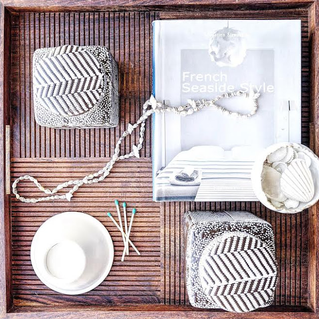
I used this tip in the image above. Here I draped a seashell necklace across my coffee table tray which really adds some movement and an air of lived-in casualness. It works because it fits the achromatic color scheme of my set-up and adds to the overall story of texture, seaside, and casual elegance.
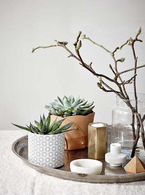
I love how the twigs in the clear vase create motion on this coffee table tray. You have these cute little succulents and candles, but then your eye is drawn to the height of the twigs and their imperfect shape- it works perfectly!
This image (no link, source unknown sorry!) There is a simple elegance going on, and the soft hydrangeas are the crowning glory of the display. Something about the soft, delicate flowers, and the straight, green stems leading to them just really adds to this look shape-wise. Love it!
If you don't know, I'm positively in LOVE with Alice Lane's style! Here they styled their coffee table tray with delicate, white roses in a clear vase. The clear vase shows off the roses' stems, connecting them to the rest of the display. Also the roses bring the perfect touch of elegance and femininity.
I love what Maria Killam has done here using two organically shape pieces- the flowers and the urchin. They're balanced on opposite ends of the vignette, and the fact that they are both organic/ unusual shapes relates them to one another. They also add some great verticality. Try covering these two pieces with your hand and imagining the display without them- It's just not quite as interesting is it?!
I am in love with the feminine charm of this set up! The roses in the vase relate to the other glass piece, and add a vertical punctuation mark that ends in off-white, elegant beauties.
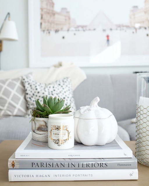
I love this simple display by the Everygirl. The creamy jar of the little succulent relates to the other off-white pieces, but then tops off the display with some unexpected free-form shape. The green is a fun punch of color too.
This vignette is by Emily Henderson herself. I love the asymmetry going on here, and how the horizontally lying tray and fruit bowl subtly stair-step their way up to a the flower vase, and then a vertical BANG of billy balls at the top. So cool!
In this lovely coffee table display by 12th and White, I love how the wild leaves bring your eye upwards, outwards, and back down to the table. They relate to the candles by pointing at them, and add the perfect amount of oomph to this simple and monochromatic display. I also love how they add so well to the asymmetry going on here too!
And last but not least, here's a round coffee table from My Domaine. Once again, put your hand over the flowers and notice how the display as a whole lacks the amount of charm you get when you take your hand away! The other pieces are cohesive and cool on their own, but the blush peonies gently drape over the pieces, helping to relate them all. They're also a wonderful addition of softness to the overall textural story. Beautiful!









.jpg)


